The Chart Below Shows Three Different Types of Crime in England and Wales
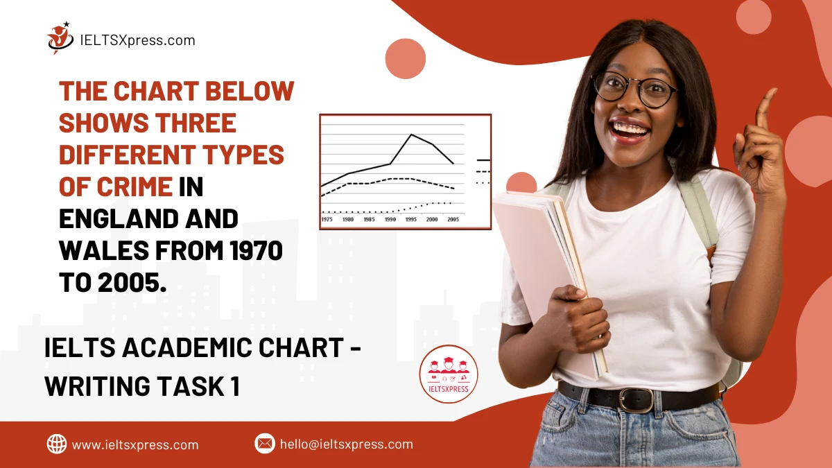
The Chart Below Shows Three Different Types of Crime in England and Wales from 1970 to 2005 including burglary, car theft data trends.
The Chart Below Shows Three Different Types of Crime in England and Wales from 1970 to 2005 including burglary, car theft data trends.
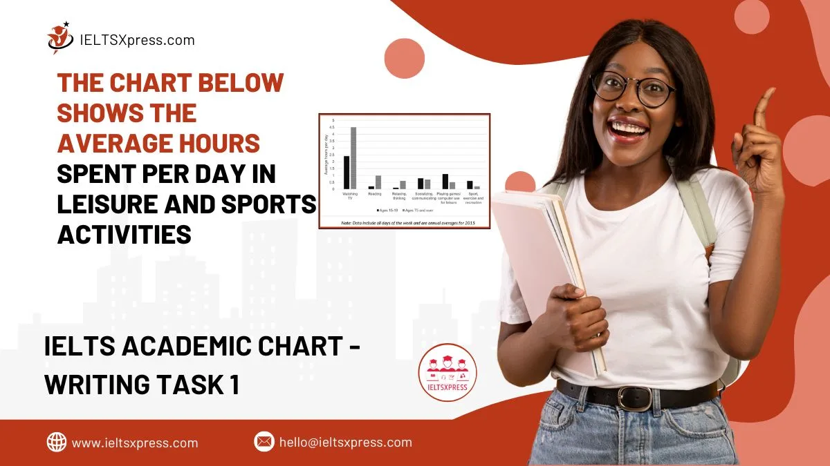
The Chart Below Shows the Average Hours Spent Per Day in Leisure and Sports Activities – analysis by age and gender based on daily time use data.
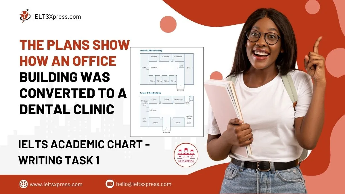
Explore this IELTS Writing Task 1 The plans show how an office building was converted to a dental clinic. Sample answer, analysis, included.
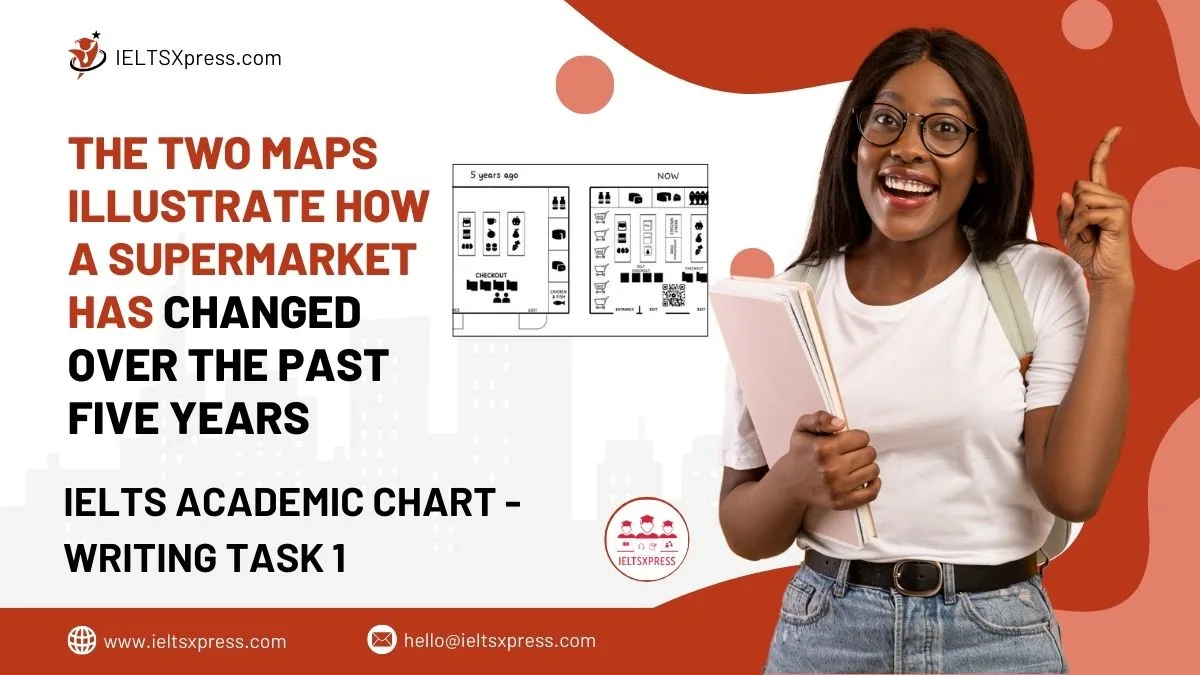
Compare The Two Maps Illustrate How a Supermarket Has Changed Over the Past Five Years. overview of layout transformations and new facilities.
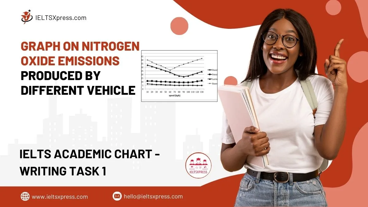
the graph compares nitrogen oxide emissions in grams per kilometer from different vehicles, showing pollution levels for cars, buses, and trucks.

Learn how to describe the IELTS bar chart on fruit production by weight for 1995, 2005, and 2015 with sample answers, tips, and key points for a high band score.
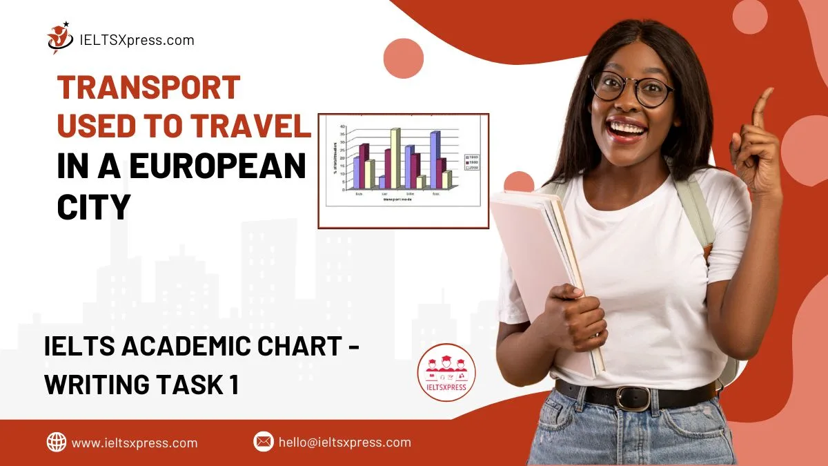
Analyze IELTS Writing Task 1 bar chart Transport used to travel in a European city. Learn structure, vocabulary, and tips to write a high-band response.
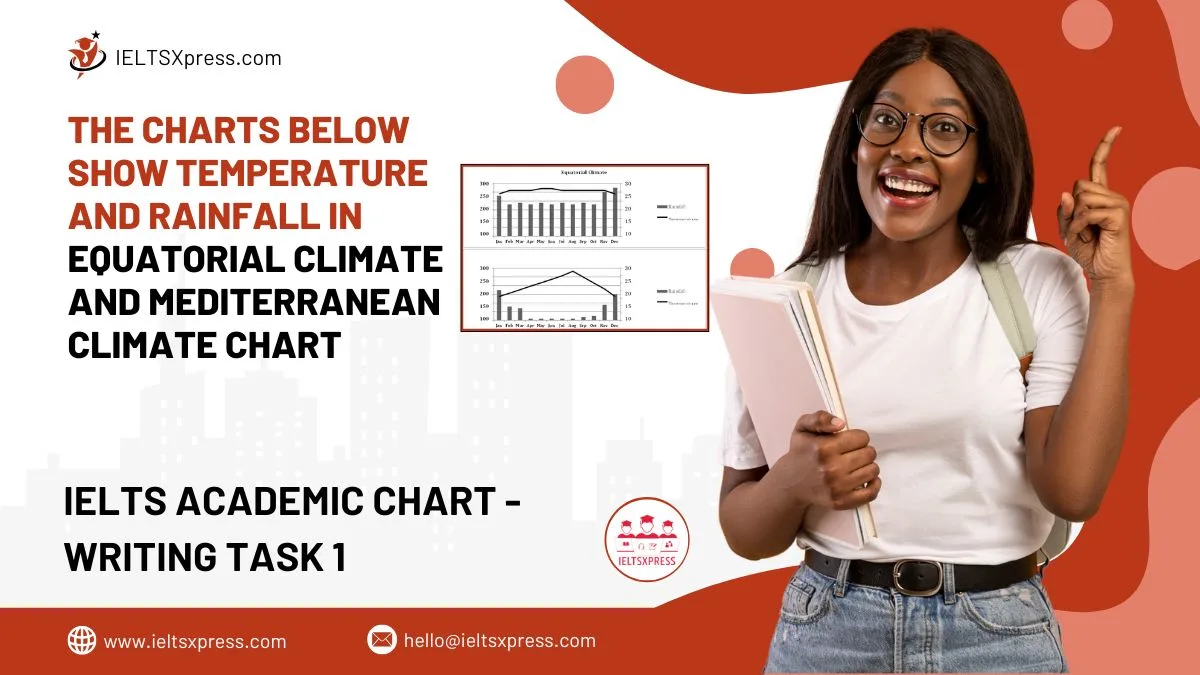
The Charts Below Show Temperature And Rainfall In Equatorial Climate And Mediterranean Climate – compare weather patterns and trends.

Patients Visiting a Clinic an analysis of trends shown in the line graph over a specific period.
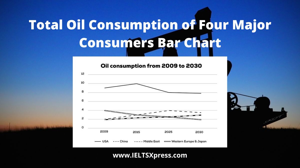
The graph below shows information about the total oil consumption of four major consumers from 2009 to 2030 IELTS Academic line chart.
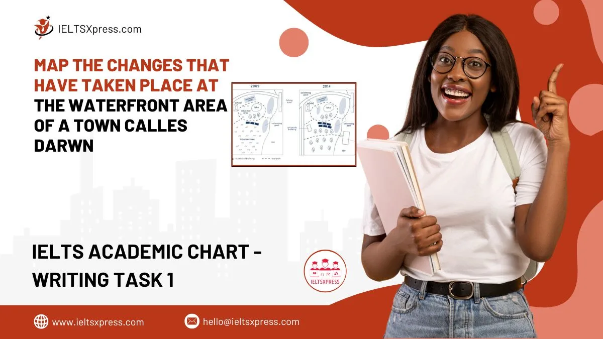
Map the changes that have taken place at the waterfront area of a town called Darwin IELTS Academic Writing Task 1 visual changes explained.
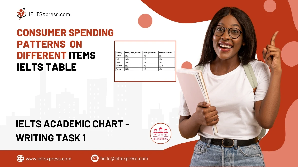
Analyze consumer spending patterns on different items in five countries in 2005 for IELTS Writing Task 1. Learn how to structure your response effectively.
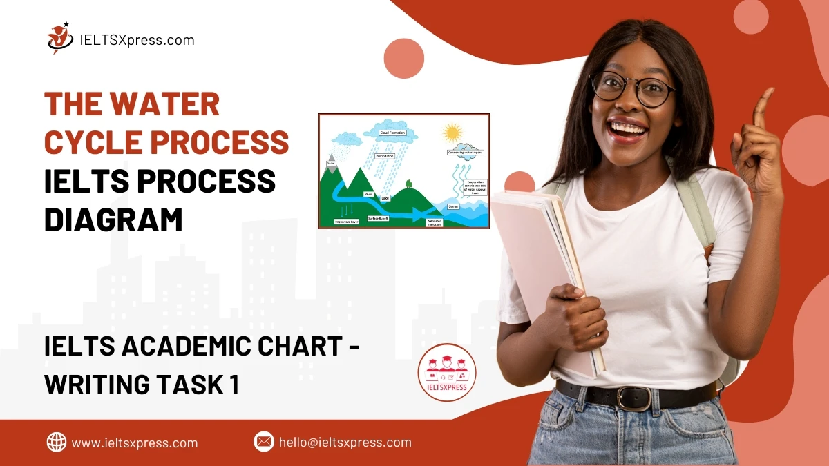
Learn how to describe The Water Cycle Process for IELTS Writing Task 1 with a clear and structured approach. Improve your band score with this guide.
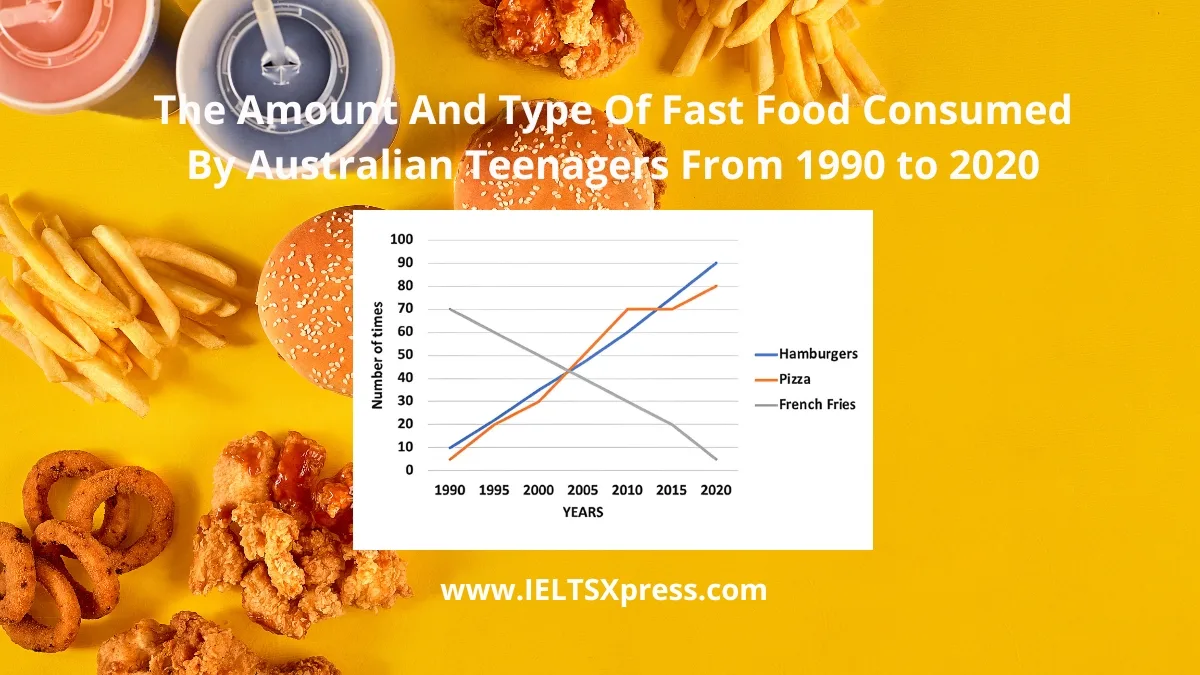
The line graph shows The Amount and Type of Fast Food Consumed by Australian Teenagers (1990-2020) IELTS Line Graph Analyze trends and key insights.
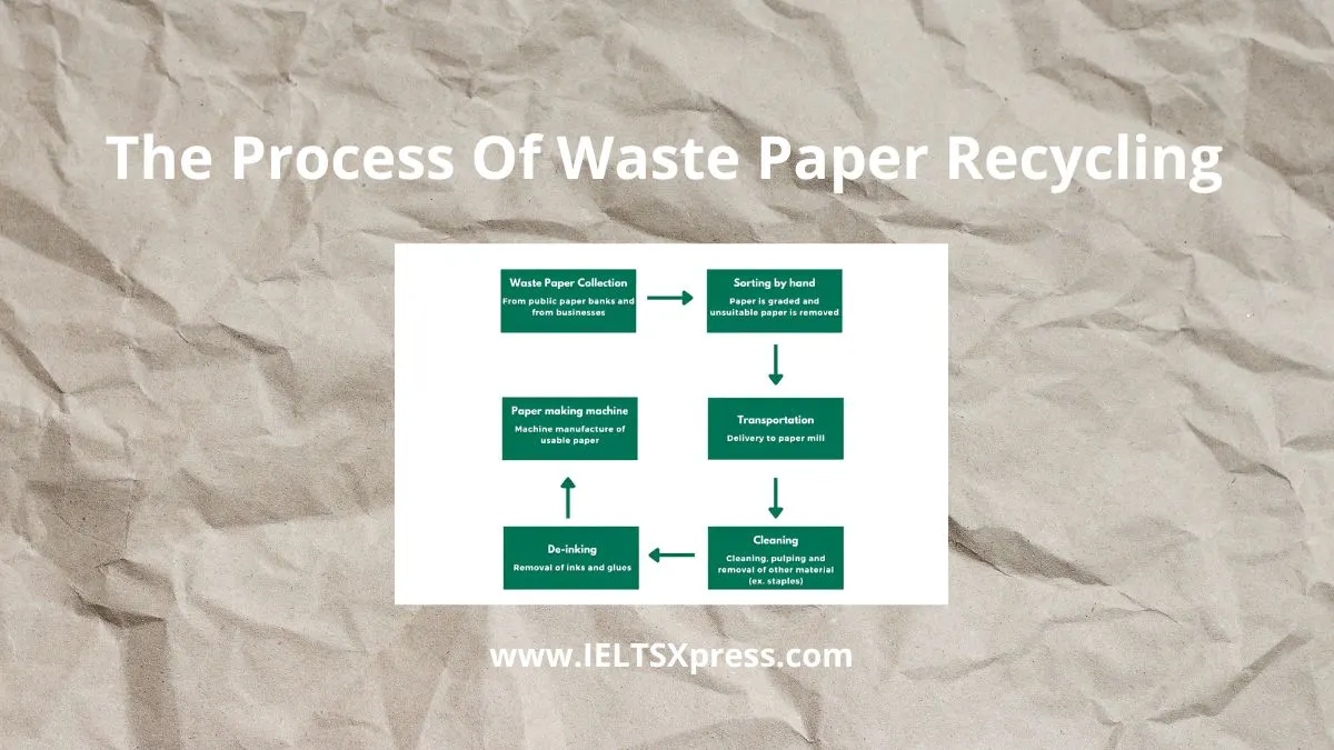
The Process of Waste Paper Recycling IELTS Writing Task Learn how to describe the recycling process clearly and effectively.