United States spending patterns between 1966 and 1996 Pie Chart
You should spend about 20 minutes on this task.
Real IELTS Exam Question, Reported On:
Practice with Expert IELTS Tutors Online
Apply Code "IELTSXPRESS20" To Get 20% off on IELTS Mock Test
| India | 5th November 2022 |
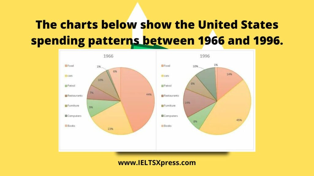
The charts below show the United States spending patterns between 1966 and 1996.
Summarise the information by selecting and reporting the main features and make comparisons where relevant. Write at least 150 words.
United States spending patterns between 1966 and 1996
Sample Answer 1
The given charts illustrates the seven different categories on that American spend their money in two years 1966 and 1996.
Overall, it is apparent that needs are changed with time, in the first year, people spent a big chunk of their money on food, but after certain decades people spent money on cars for transportation.
To begin with two main categories on which Americans spent their maximum money all the time and that were Food and cars. Together they consumed over half of the household spending. Food accounted for 44% of spending in starting, but this dropped to 14% in 1996. However, cars spending was doubled, rising from 23% in 1966 to 45% in 1996.
Furthermore with other categories, a nearly equal amount was spent on petrol in both years but in 1996 people spent 14% of their money on restaurants that were double the amount they spent in 1966. Americans showed less interest to buy furniture, so that’s why the amount was declined by 2% in 1996 and recorded as 8%. In 1966, people were unaware of the computer, so they spent only 1% of their money in this category, but it jumped to 10 in 1996. on the other hand, the percentage of spending on books fell from 6% to 1%.
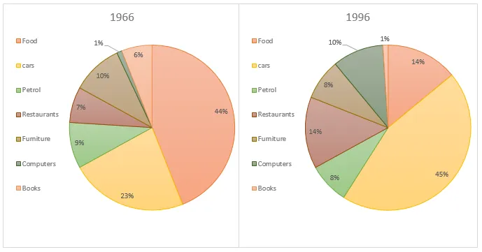
The charts below show the United States spending patterns between 1966 and 1996
The pie charts show changes in American spending patterns between 1966 and 1996.
Food and cars made up the two biggest items of expenditure in both years. Together they comprised over half of household spending. Food accounted for 44% of spending in 1966, but this dropped by two thirds to 14% in 1996. However, the outlay on cars doubled, rising from 23% in 1966 to 45% in 1996.
Other areas changed significantly. Spending on eating out doubled, climbing from 7% to 14%. The proportion of salary spent on computers increased dramatically, up from 1% in 1996 to 10% in 1996. However, as computer expenditure rose, the percentage of outlay on books plunged from 6% to 1%.
Some areas remained relatively unchanged. Americans spent approximately the same amount of salary on petrol and furniture in both years.
In conclusion, increased amounts spent on cars, computers, and eating out were made up for by drops in expenditure on food and books.
