The Chart Below Shows Three Different Types of Crime in England and Wales
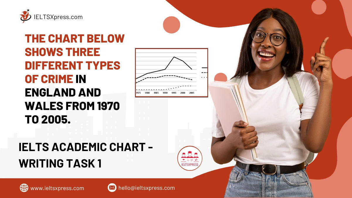
The Chart Below Shows Three Different Types of Crime in England and Wales from 1970 to 2005 including burglary, car theft data trends.
The Chart Below Shows Three Different Types of Crime in England and Wales from 1970 to 2005 including burglary, car theft data trends.
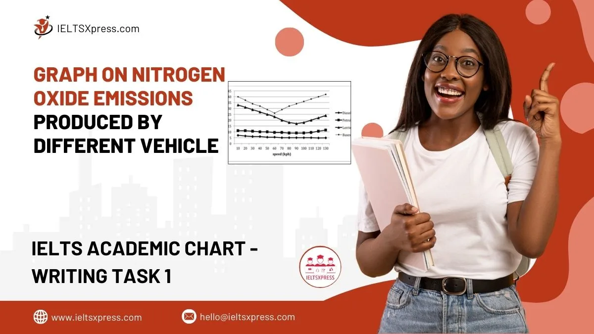
the graph compares nitrogen oxide emissions in grams per kilometer from different vehicles, showing pollution levels for cars, buses, and trucks.
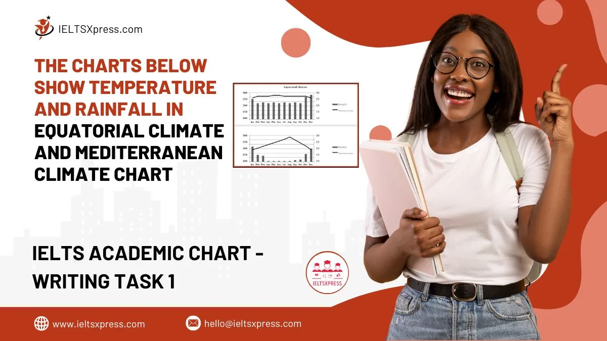
The Charts Below Show Temperature And Rainfall In Equatorial Climate And Mediterranean Climate – compare weather patterns and trends.
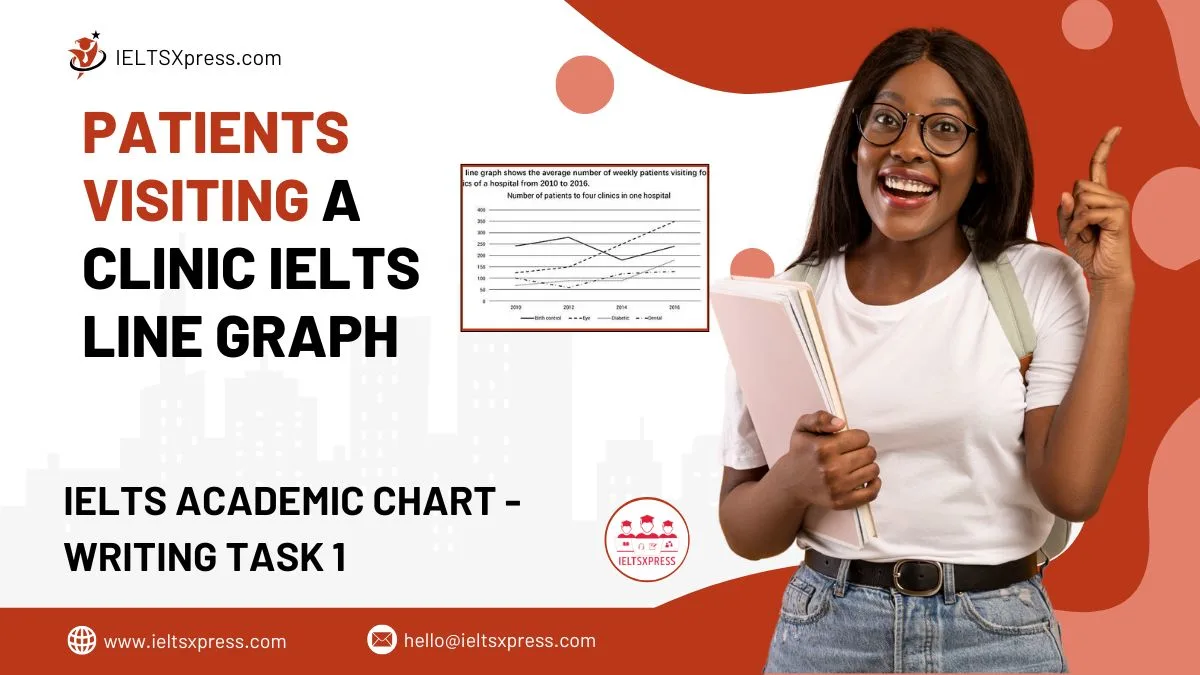
Patients Visiting a Clinic an analysis of trends shown in the line graph over a specific period.
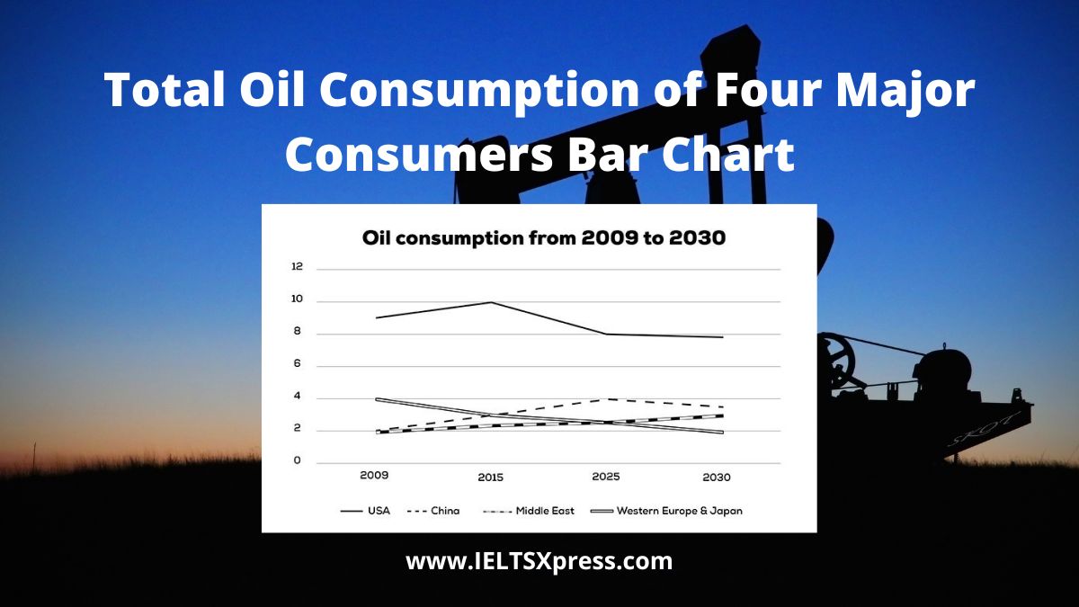
The graph below shows information about the total oil consumption of four major consumers from 2009 to 2030 IELTS Academic line chart.
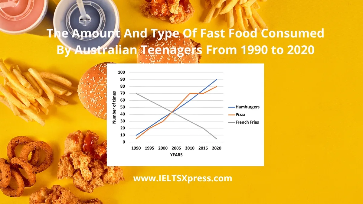
The line graph shows The Amount and Type of Fast Food Consumed by Australian Teenagers (1990-2020) IELTS Line Graph Analyze trends and key insights.
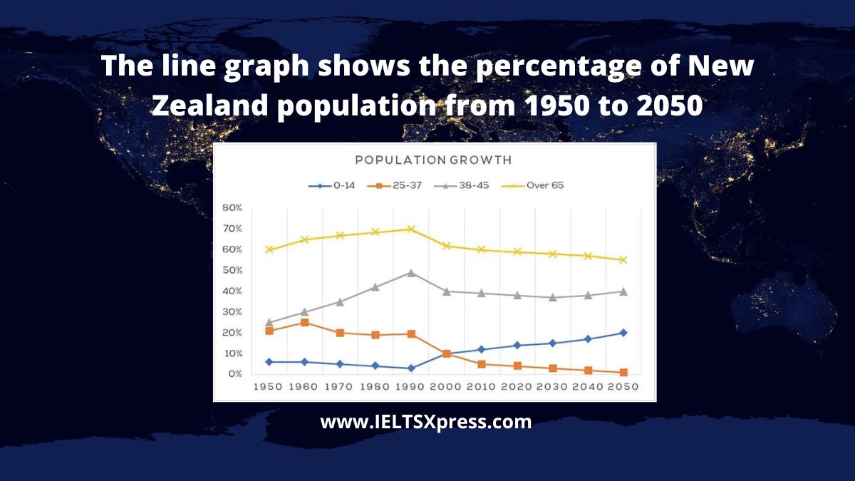
The line graph shows the percentage of New Zealand population from 1950 to 2050 IELTS Academic Writing Task 1 Line Chart.
The graph below shows information about the total oil consumption of four major consumers from 2009 to 2030 IELTS Academic line chart.
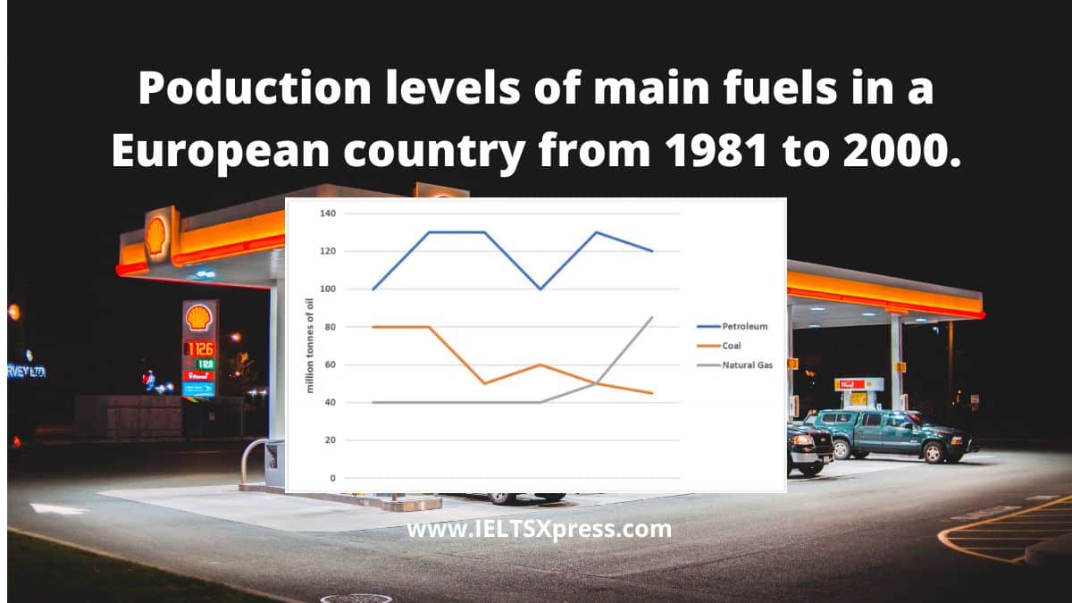
The graph below shows the production levels of main fuels in a European country from 1981 to 2000 Measured in tonnes IELTS Academic writing 1.
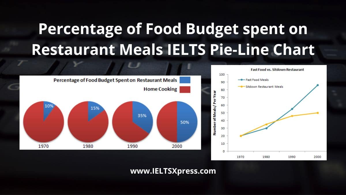
The charts below show the percentage of food budget the average family spent on restaurant meals in different years. The graph shows the number of meals eaten in fast food restaurants and sit-down restaurants.

The line graph shows the percentage of different age groups of cinema visitors in a particular country from 1978 to 2008 IELTS Writing Task 1.
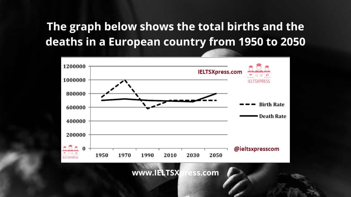
The graph below shows the total births and the deaths in a European country from 1950 to 2050 IELTS Line Chart Task 1.
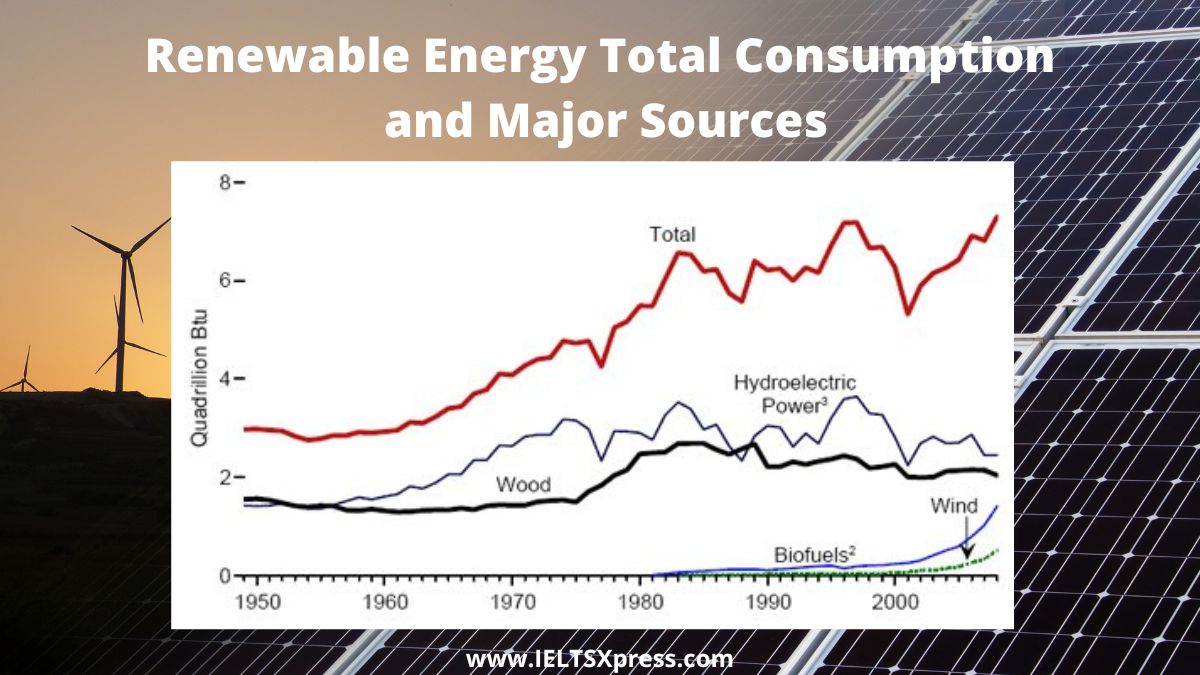
University lecturer identifying the main trends and making comparisons. Renewable Energy Total Consumption and Major Sources 1949-2008
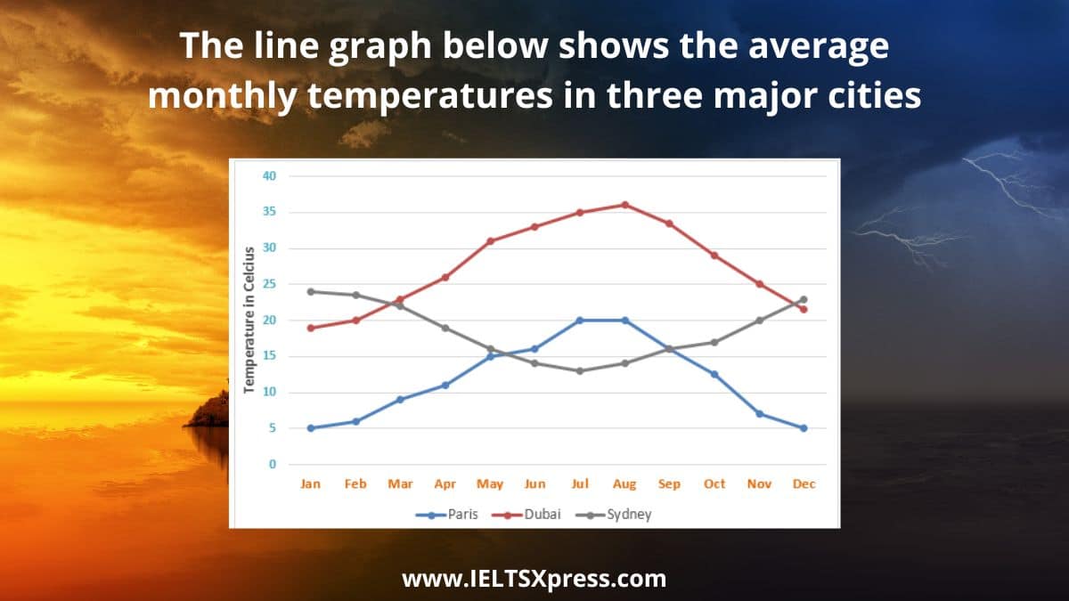
IELTS Average Monthly Temperatures in Three Cities. The line graph below shows the average monthly temperatures in three major cities.
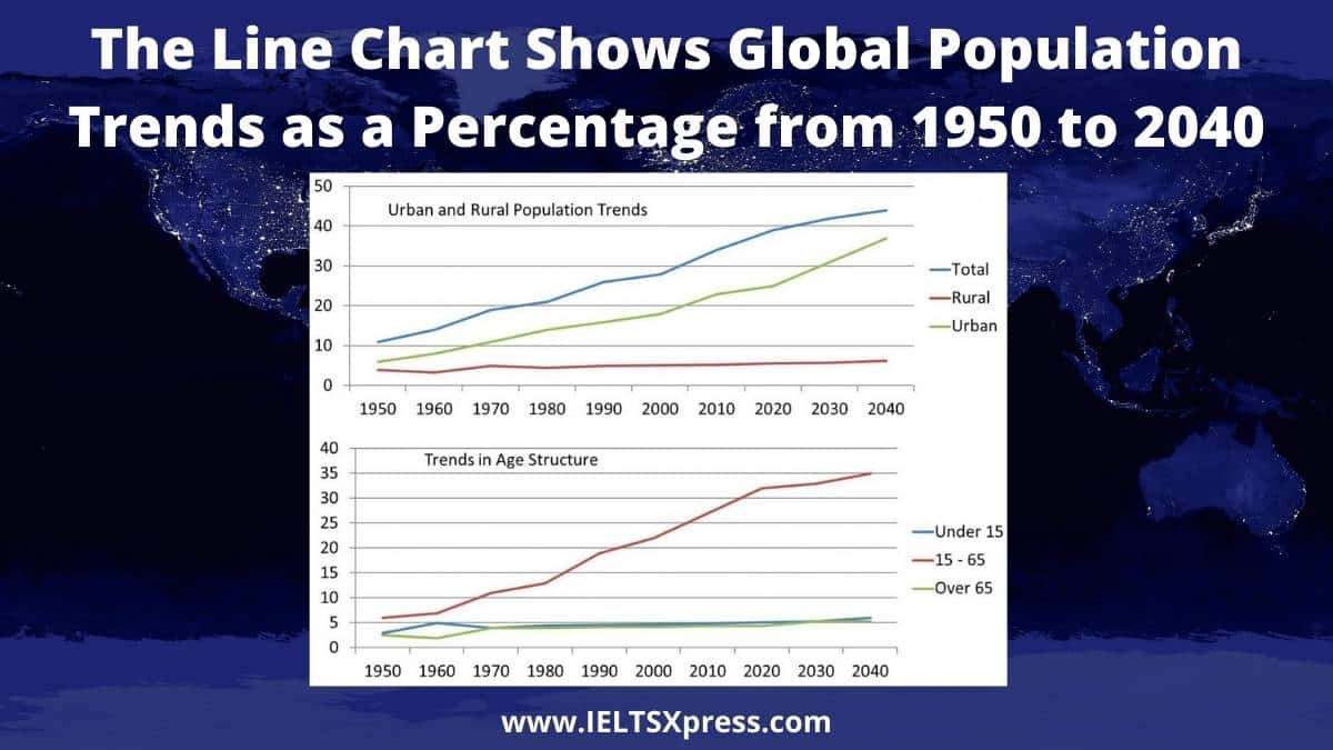
The line chart shows global population trends as a percentage from 1950 to 2040. Global Population Trends Line Chart IELTS Writing Task 1