Table Shows Percentage of First Year Students
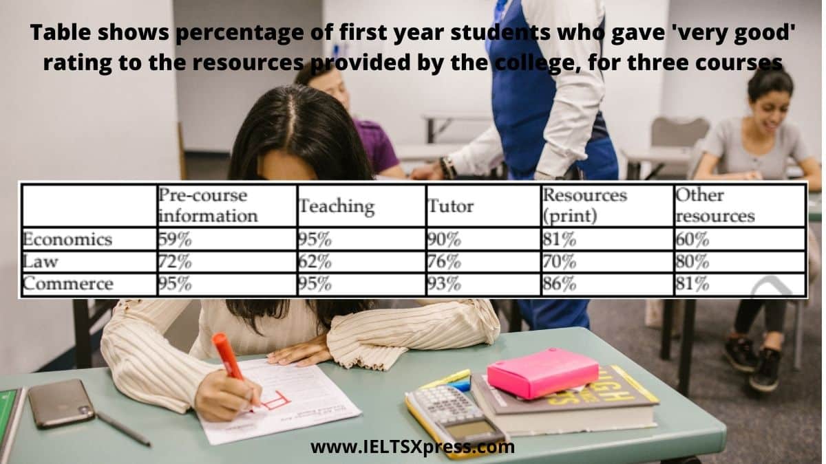
Table shows percentage of first year students who gave ‘very good’ rating to the resources provided by the college, for three courses. IELTS Task 1.
Table shows percentage of first year students who gave ‘very good’ rating to the resources provided by the college, for three courses. IELTS Task 1.
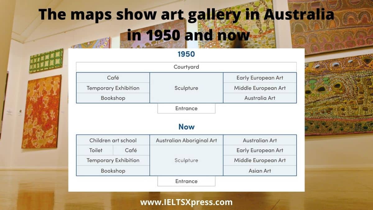
The maps show art gallery in Australia in 1950 and now. IELTS Academic Writing Task 1 Map Writing Australia’s art gallery.

The line chart shows global population trends as a percentage from 1950 to 2040. Global Population Trends Line Chart IELTS Writing Task 1
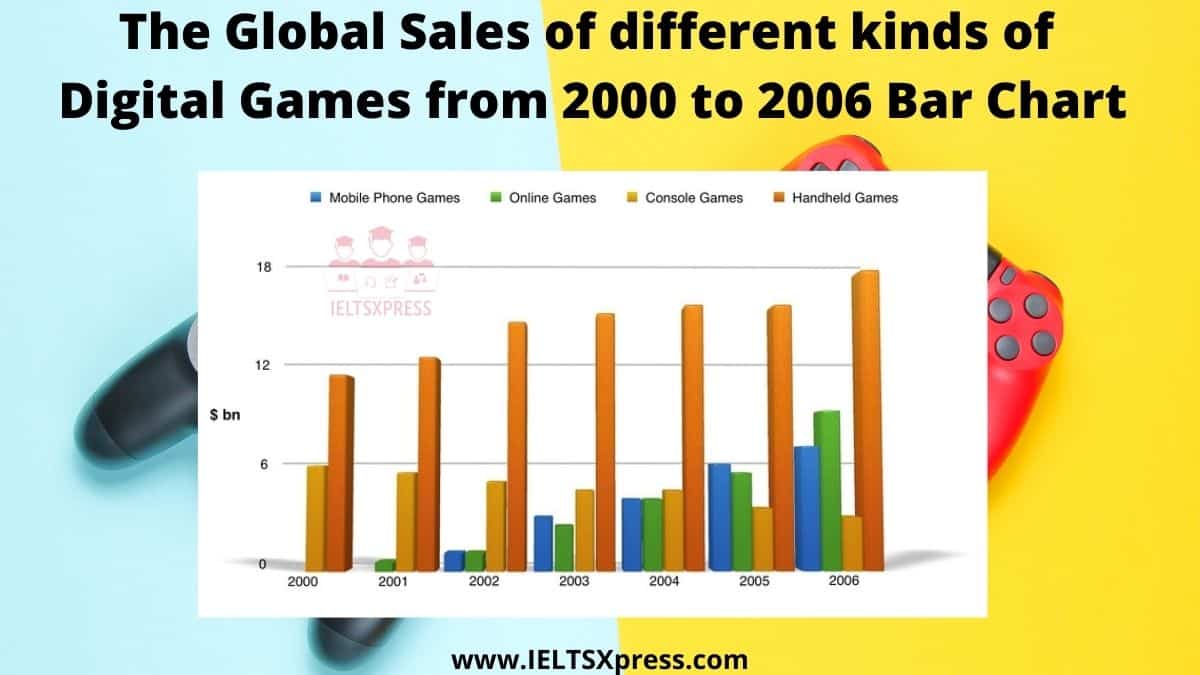
The chart below shows the global sales of different kinds of digital games from 2000 to 2006. IELTS Writing Task 1 Bar Chart Sample Answers.
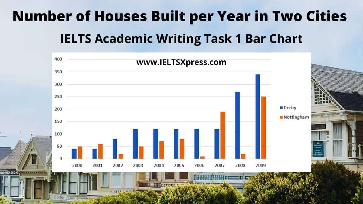
IELTS Writing Task 1 The bar chart below shows the number of houses built per year in two cities, Derby and Nottingham, between 2000 and 2009.

The chart shows the proportion of people in a UK survey carried out in three different years who said they were interested in certain sports.
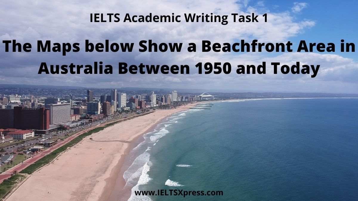
IELTS Writing Task 1 Map Writing. The Maps below show a beachfront area in Australia between 1950 and today.

IELTS Writing Task 1 Graph Writing. IELTS Academic Writing Two charts below show the percentage of qualified graduates in a particular country

IELTS Writing Task 1 Graph Writing. IELTS Academic Writing Two charts below show the percentage of qualified graduates in a particular country

The graph below shows the percentage of people unemployed in the total labour workforce across 9 countries in 1994 and 2004. IELTS Academic Writing Task 1.
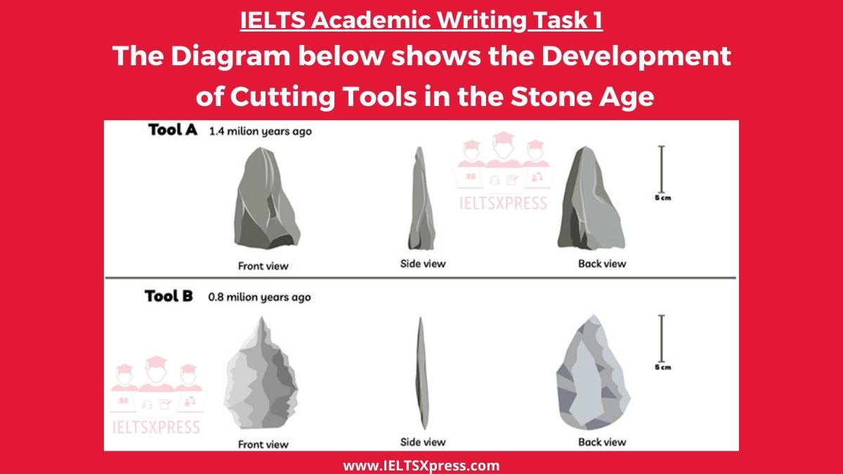
IELTS Academic Writing Task 1. The diagram below shows the development of cutting tools in the stone age. One was made 1.4 million years ago, and the other was made 800 thousand years ago (viewing from the back view, front view, and side view)
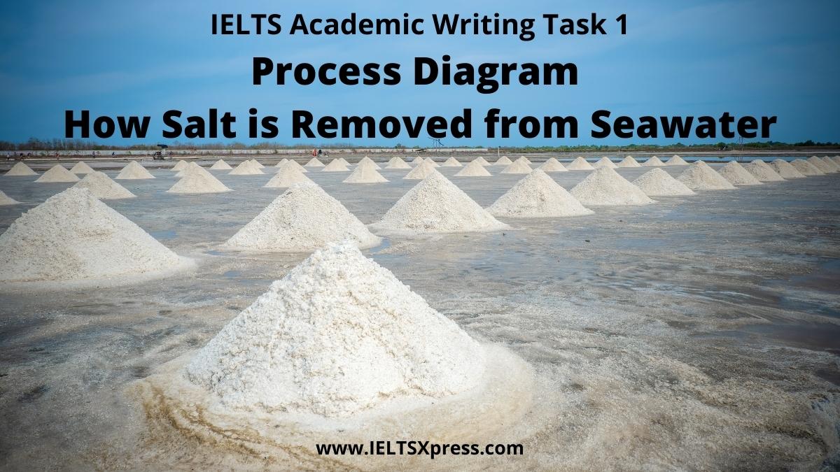
IELTS Academic Writing Task 1. The diagram below shows how salt is removed from seawater to make it drinkable
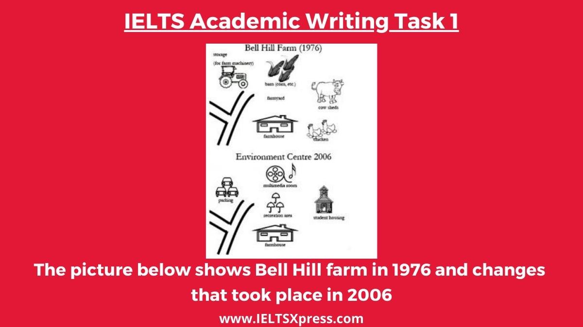
The picture below shows Bell Hill farm in 1976 and changes that took place in 2006. IELTS Academic Writing Task 1 Graph Writing. Bell Hill Farm.
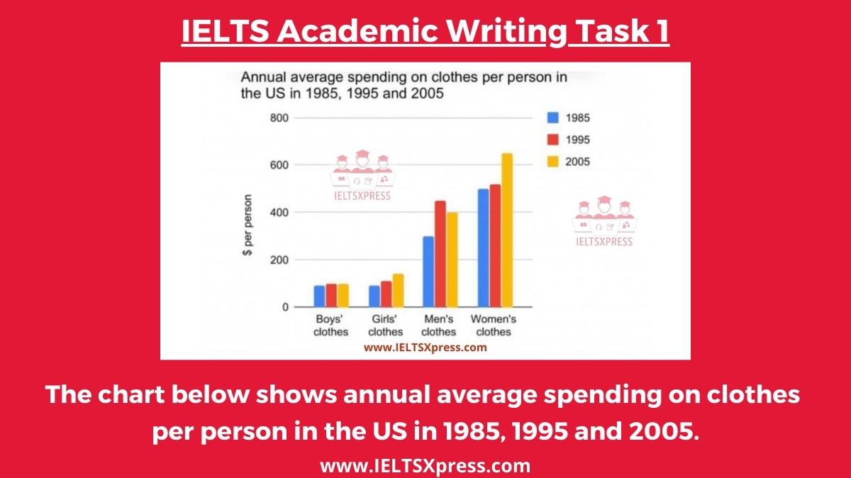
The Chart below shows Annual Average Spending on Clothes per person in the US in 1985, 1995 and 2005 IELTS Writing Task 1 Bar Chart.

The table below illustrates how much money a single person and a couple in Australia need for a comfortable lifestyle after they retire.