
Diagram Describes the Recycling Process of Aluminum Cans
The maps show a road system as it is now and the proposed changes in future to reduce the number of accidents IELTS Academic Writing Task 1.
The maps show a road system as it is now and the proposed changes in future to reduce the number of accidents IELTS Academic Writing Task 1.
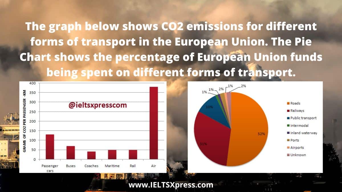
The graph below shows CO2 emissions for different forms of transport in the European Union. The Pie Chart shows the percentage of European Union funds being spent on different forms of transport.
Present and Planned Development in the Biomedical Campus of a University Diagram IELTS Academic Writing Task 1
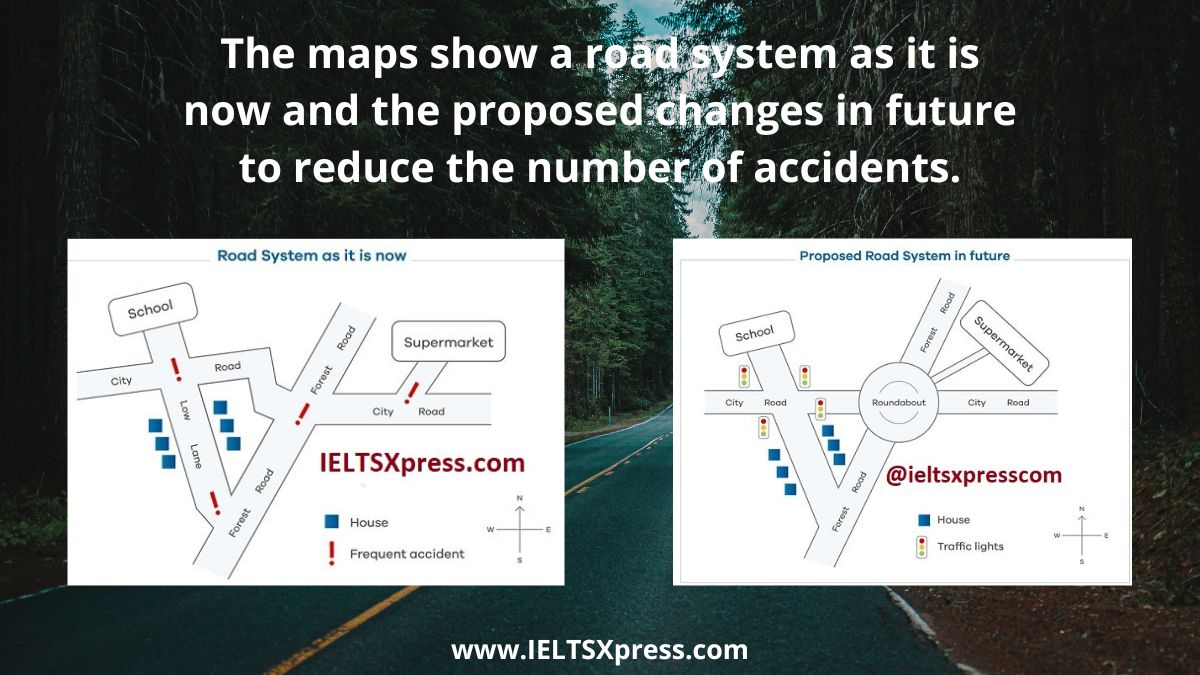
The maps show a road system as it is now and the proposed changes in future to reduce the number of accidents IELTS Academic Writing Task 1.
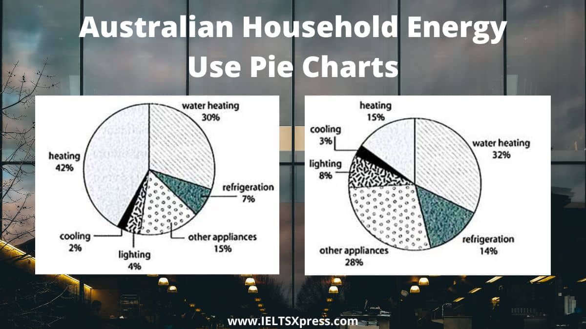
The first chart below shows how energy is used in an average Australian household. The second chart shows the greenhouse gas emissions which result from this energy use.
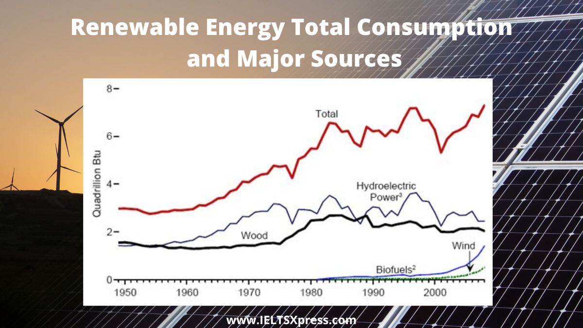
University lecturer identifying the main trends and making comparisons. Renewable Energy Total Consumption and Major Sources 1949-2008
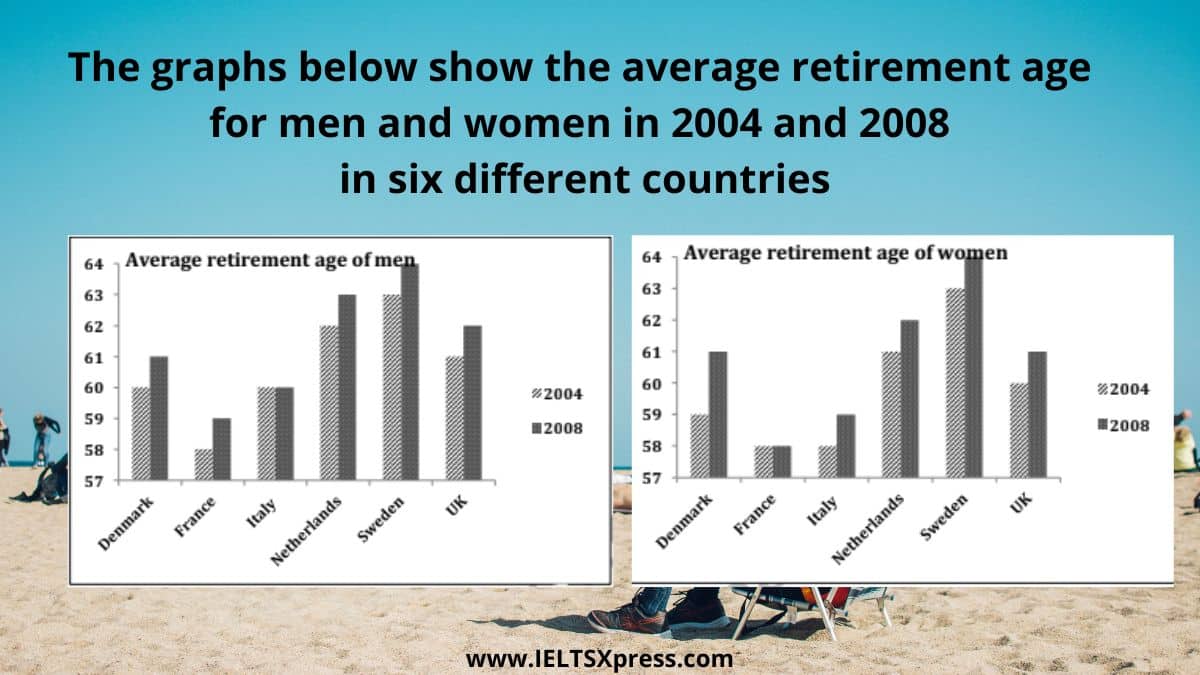
IELTS Writing Task 1 Bar Chart. The graphs below show the average retirement age for men and women in 2004 and 2008 in six different countries

The diagrams below show some principles of house design for cool and for warm climates IELTS Academic Writing Task 1 Process Diagram.

The diagram shows the small-scale production of smoked fish. IELTS Academic Writing Task 1 Process Diagram Fish Smoking.
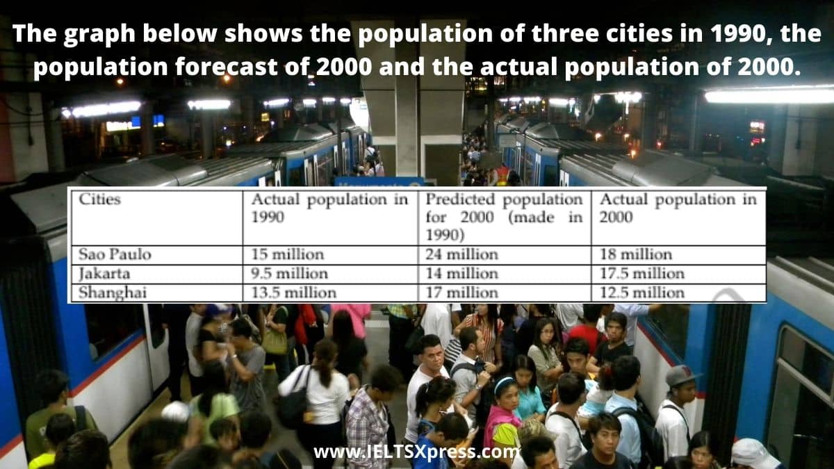
The graph below shows the population of three cities in 1990 the population forecast of 2000 and the actual population of 2000 IELTS Writing Task 1
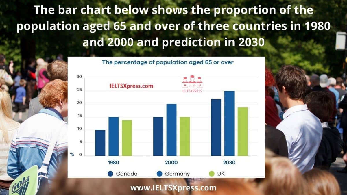
The bar chart below shows the proportion of the population aged 65 and over of three countries in 1980 and 2000 and prediction in 2030 ielts task 1
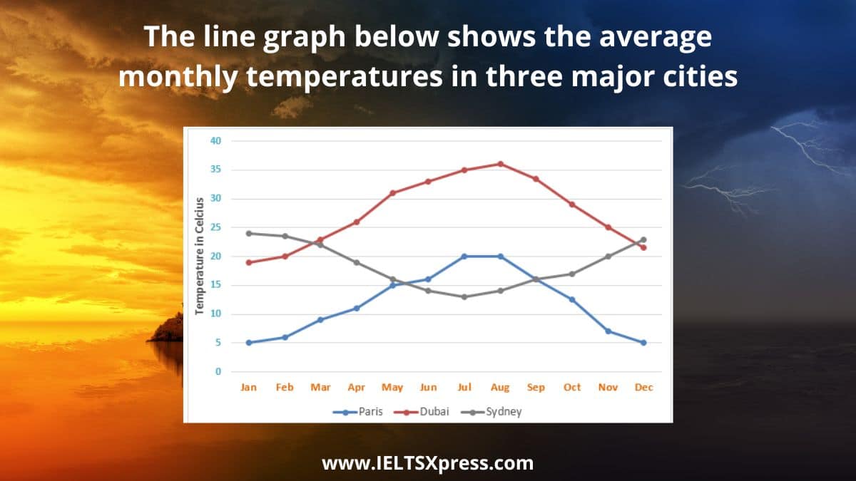
IELTS Average Monthly Temperatures in Three Cities. The line graph below shows the average monthly temperatures in three major cities.
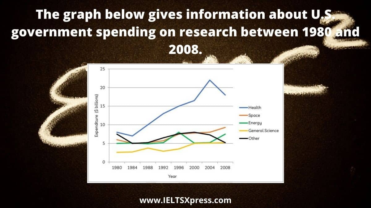
The graph below gives information about U.S. government spending on research between 1980 and 2008. IELTS Academic Writing Line Chart.
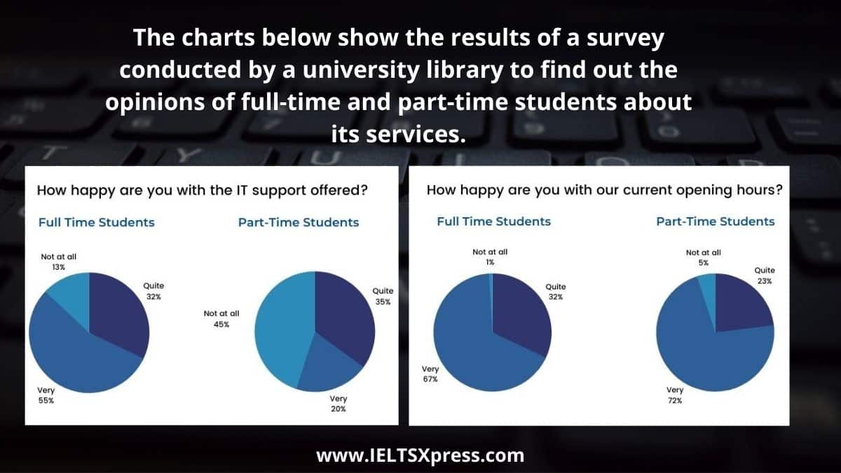
The charts below show the results of a survey conducted by a university library to find out the opinions of full-time and part-time students about its services.
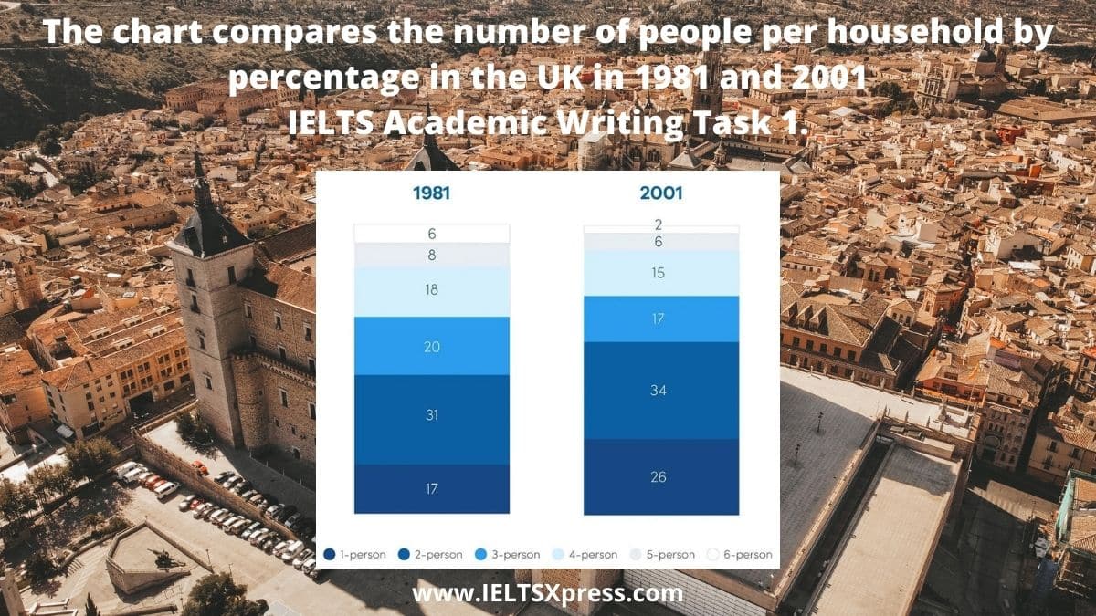
The chart compares the number of people per household by percentage in the UK in 1981 and 2001 IELTS Academic Writing Task 1.