the Line Graph gives Data about the Number of Users of Five
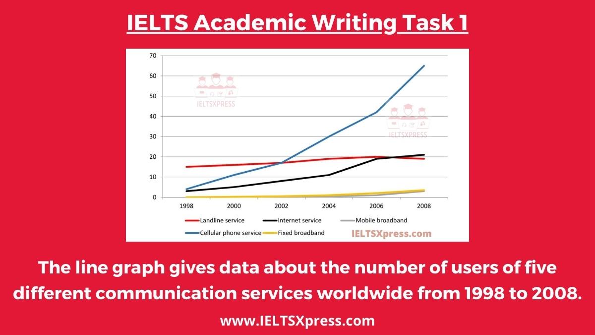
The line graph gives data about the number of users of five different communication services worldwide from 1998 to 2008 IELTS Graph Writing.
The line graph gives data about the number of users of five different communication services worldwide from 1998 to 2008 IELTS Graph Writing.
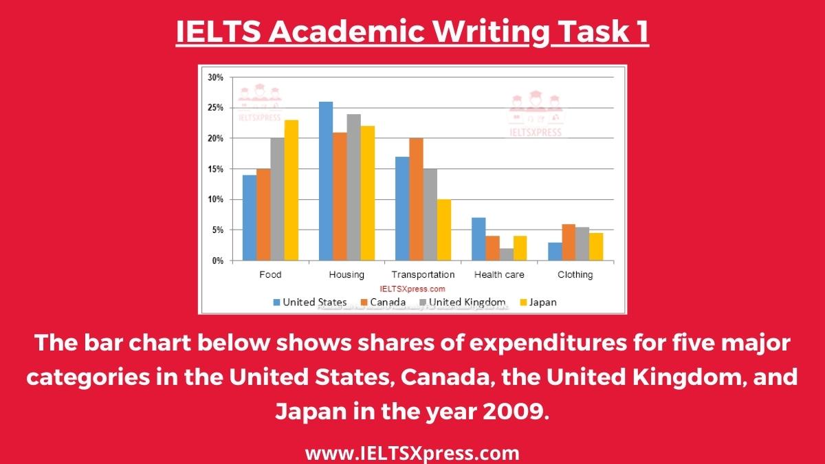
The bar chart below shows shares of expenditures for five major categories in the United States, Canada, the United Kingdom, and Japan in the year 2009
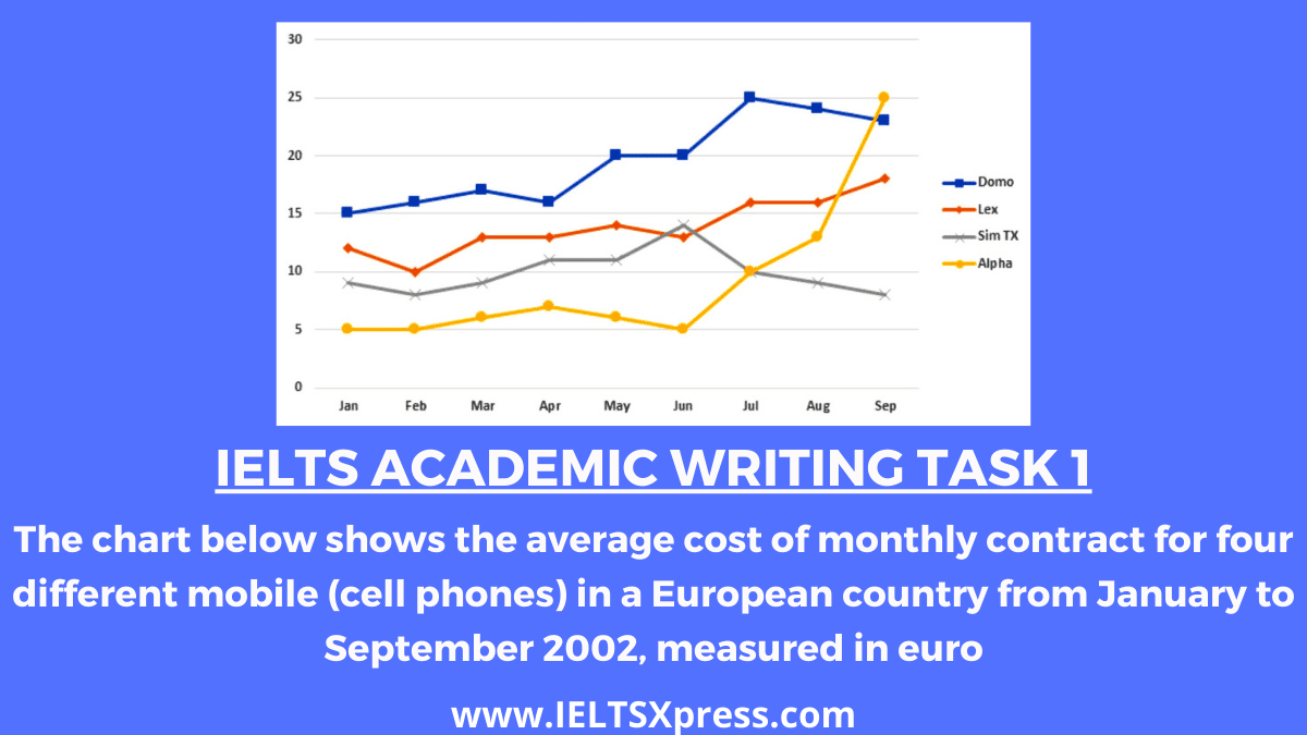
The chart below shows the average cost of monthly contract for four different mobile (cell phones) in a European country from January to September 2002, measured in euro.
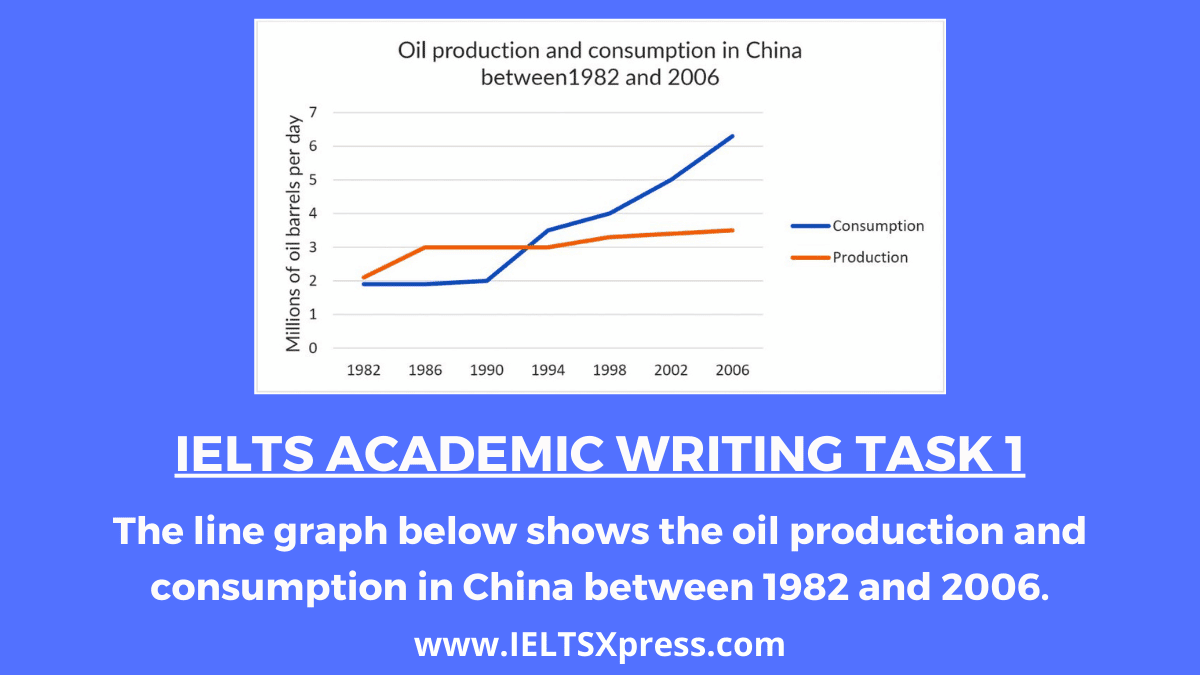
IELTS Academic Writing The line graph below shows the oil production and consumption in China between 1982 and 2006 IELTS Writing Task 1.
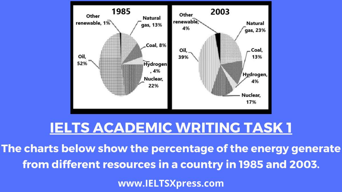
IELTS Academic Writing The charts below show the percentage of the energy generate from different resources in a country in 1985 and 2003.
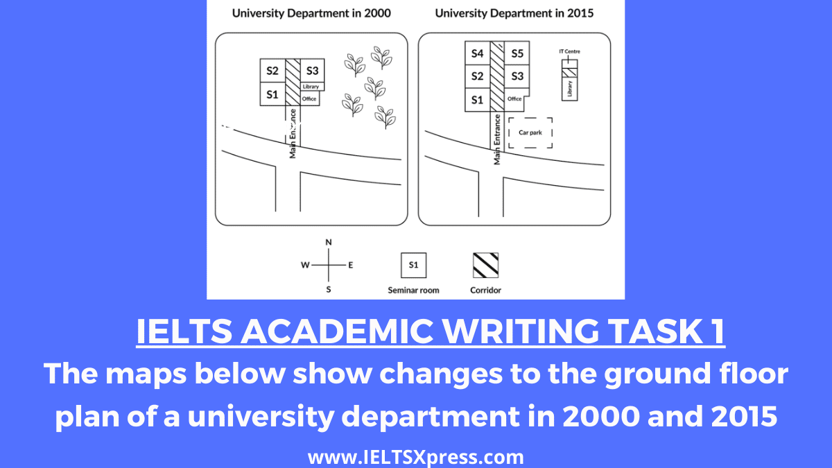
IELTS Academic Writing Task 1 The maps below show changes to the ground floor plan of a university department in 2000 and 2015

IELTS Academic Writing The table below shows the percentage of the population and the types of houses they live in 3 areas of a city IELTS Graph.

IELTS Academic Writing Task 1. The diagram below describes the structure of a home smokery and how it works. Summarise the information by selecting and reporting the main features and make comparisons where relevant.

IELTS Academic Writing Task 1. The Diagram shows how rainwater is collected for the use of drinking water in an Australian town. Summarise the information by selecting and reporting the main features, and make comparisons where relevant.

IELTS Academic Writing Task 1 The graph and chart below give information about the number of new graduates and their employment in the UK from 1992 to 2002.
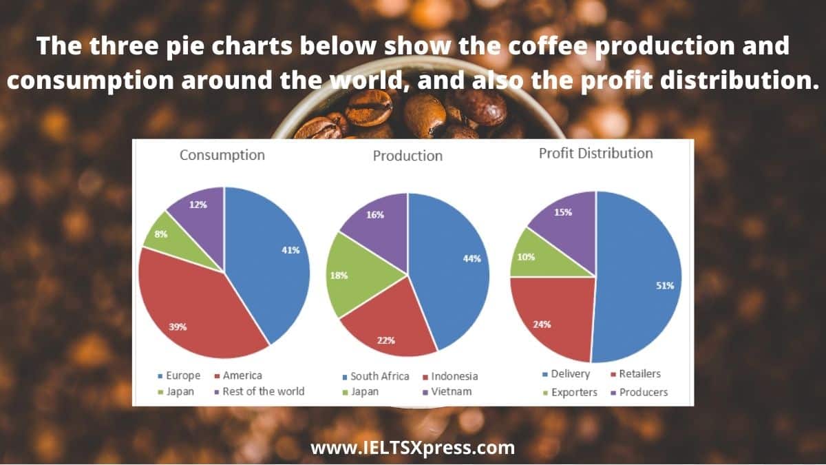
IELTS Academic Writing Task 1 The three pie charts below show the coffee production and consumption around the world, and also profit distribution
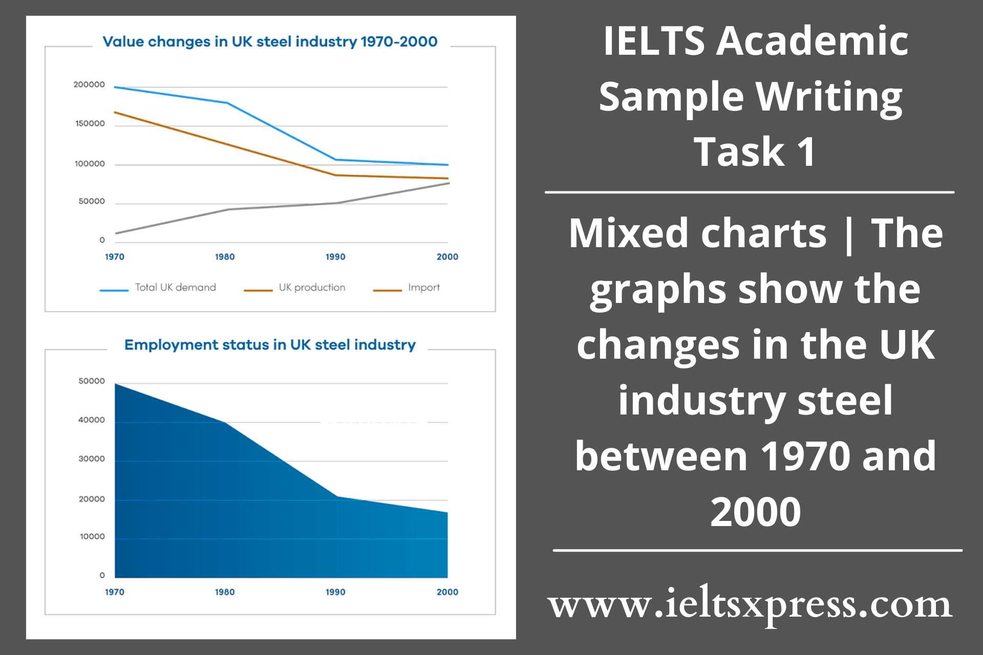
IELTS Writing Task 1 – Mixed Chart – The graphs show the changes in the UK industry steel between 1970 and 2000. (million tonnes vs thousand).
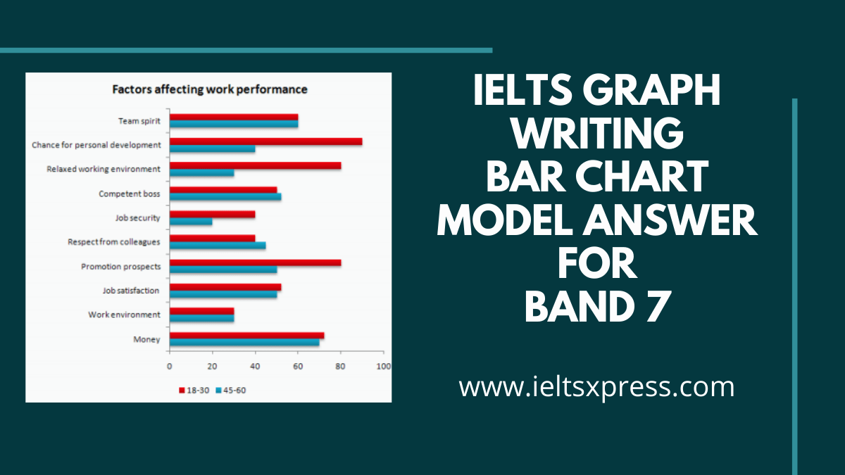
IELTS Writing Bar Chart Band 7 Model Answer: Factors affecting Work Performance. The bar chart below shows the results of a survey conducted by a personnel department at a major company.

Improve your Academic module Graph writing by practicing with Makkar Graph writing. You can download the LATEST MAKKAR Graph Writing PDF Free Download on our website https://www.ieltsxpress.com simply by clicking the below download button.